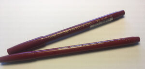
Neal Adams Red Marvy Marker, and Pentel pens.
In the ‘60s comic book color was 64-color big dot flat. It was hand-separated low resolution CMYK (Cyan, Magenta, Yellow, Black.) printed on newsprint. It had to be low resolution because the ink would spread as soon as it went on to the cheap newsprint paper comics were printed on at the time.
It was rare when the coloring made any real impression. Mostly you’d notice the color when it got out-of-register. (Where printing plates shift slightly, so things just don’t line up…) That happened all the time.
But every once in a blue moon, someone would get the order of the plates wrong, and the colors would go bananas. Anybody could tell something was wrong then. But generally color was unobtrusive.
When a colorist did something different, or the starkness of the art set the color up, it really stood out. The Molten Man cover to Spiderman #28 leapt off the racks for me as a kid. (I just loaded it on the internet, and it looks a lot different in my memory…)
Covers were different, though. To begin with, they were on a thicker, glossier cover stock with a finer line screen on the art. They often had grayscale on the black plate, with airbrush modeling. Sometimes they even had airbrush tones on the Cyan or Magenta plates.
But inside the comics, they were pretty basic until guys like Jim Steranko started experimenting.
The artist whose colors made the biggest impression on me as a kid was Neal Adams. There was something different about the colors he used on Batman and Green Lantern/Green Arrow. I knew Tom Palmer was coloring a lot of his stuff over at Marvel, but I had no idea what was going on at DC. (Now I know it was probably Neal coloring his own stuff, or his wife at the time, Cory Adams. I could be wrong about that though. I haven’t asked Neal about it.)

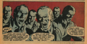
Neal Adams Red and Blue color scheme from Green Lantern/ Green Arrow.
I really liked it & especially how he used Zip-a-Tone to different effects. One color scheme sticks in my mind to this day. I don’t remember the art or story, just those colors. It had a weird dark red Background, and the figures were mid-to-light Cyan with pure white highlights. The value structure, the colors, and whatever cool Neal Adams art there was…It all added up to a memorable image.
What made it all work, though, was that weird red. I couldn’t figure out how they got that color. I was in the 7th or 8th grade, so I borrowed my mom’s magnifying glass to look really closely at the page. Because of a slight out-of-registration, it allowed me to see the individual CMYK plates against the white paper. From that, I was able to translate the color into CMYK. (I just got some new information about this, so my facts may be wrong. I’ll update this post again once I know more…)
It turned out to be 100% M, 25% or 50% Cyan, and instead of 100% Yellow, which would make it a normal slightly darkened red, it was 25% or 50% Yellow. This pulled that red into a muted, off color I named:
Neal Adams Red.
When I first started professionally coloring comics, I found a Marvy Marker that was Neal Adams Red. I used it all over the place. Even into the computer era, we used a digital version, and everybody at Olyoptics knew it as Neal Adams Red.
It was the first color I ever researched, and it’s the only color I’ve ever named after an artist.
I love that color.
