OLYOPTIC TIMELINE
1978 ~ The Full Color Era Begins
1981-89 ~ The Experimental Era
1992 ~ The Image Era
1995-2002 ~ The New Reality
1978 ~ The Full Color Era Begins
The Old Era: For 40 years color in the American comic industry used a simple, hand separated 4-color system. Using a code that specified 25, 50 and 100% increments of the 4 printing inks (Cyan, Magenta, Yellow and Black, commonly known as CMYK) comics used a 64 color system. Limiting the palette to 64 colors kept the costs down, and were about all that would easily reproduce on the cheap newsprint paper used for comics. Airbrushing and special effects were reserved for covers, which are heavier coated paper stocks.
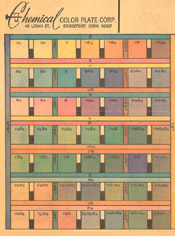
Chemical Process Palette
The hand separations were often done by Chemical Color of Derby, Connecticut. A hand separation was a tedious job. Each percentage of a color had to be painted on a separate acetate overlay using Rubylith paint, photographed at the proper screen and then registered (lined up) and combined to create a film negative that was used to burn the printing plates.
To create a light green, for instance, a code of Y2B2 was used. This meant that 25% of Yellow (Y2) and 25% of Cyan (B2) are needed to get that color. In order for the color guide artists to be able to communicate with the color separators, charts of the 64 colors with their codes were printed and distributed to the colorists. Photostats or Xerox copies of the original art were made at 8 ½ x 11, and the colorists used special 64 color sets of Dr. Martin’s radiant transparent watercolor (or aniline dyes) to color them. Then they would write codes from the chart on the guides, which the separators used to know which color the guide artists actually wanted. (As opposed to guessing)
This system worked in the comic industry from the late 30’s, with mixed results. There was plenty of room for error, and even the best results were very limiting. The traditional flat color look of comics is based on this 64 color system.
Although most comics used this system until the 1980’s, these limitations began to be broken in the late 1970’s.
The Full Color Era Begins: The first time I ever saw full color comic art wasn’t in a comic book. It wasn’t in a book at all. It was on bubblegum cards. In 1966 the Batman TV show spawned a ton of merchandising. For the bubblegum trading cards they hired pulp fiction illustrator, Norm Saunders to paint 3 series of fully rendered 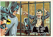 Batman and Robin cards. (He was also the artist of the famous “Mars Attacks” cards) I liked them as a kid, but they looked odd to me. I wasn’t used to seeing comic characters rendered, as well as being photo referenced (Drawn with the aid of photographs).
One book that did experiment with a form of full-color was the Canadian comic, Capt. Canuck. You couldn’t quite tell that it was full color because of the line screen and the newsprint paper, but it was interesting and different.
 The next place rendered comic color showed up was in Richard Corben’s underground comics. At first he did kind of crude separation work on the interiors, and beautiful covers. That was because he was experimenting, finding a system that would basically redefine color in comics. He was already pushing the art and story limits. Around the time he began the Den saga, he got his copy camera setup. He was combining photographic and halftone textures with his line art to amazing effect.
This allowed him to create his own color separations, and gave his art a look that was totally unlike anything else. It was a technique that no one could duplicate, so he had a corner on that kind of full color.
Full color comics and graphic albums had been published in Europe using the blueline system for years. Original art was copied in a non-reproducing blue onto artboard by a photochemical process. The color artist then painted on the blueline board. Another copy of the art was put onto clear acetate, which was used as an overlay so the colorists could see how the final product would look in print. The color was photographed separately to get clean colors, and the black was added as a separate plate. This gave a nice color look, but because of shrinkage, registration could be a problem. It was also not a cheap system, since it required photographic color separation and better paper to print on.
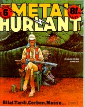 American comic readers had seen this kind of color in Herge’s TinTin books, but not many other places until the magazine Metal Hurlant came out in Dec of 1974. Metal Hurlant was published by les Humanoides Associes in France , and distributed in the USA by Bud Plant. It was an adult comic that had articles, interviews, and beautiful art. Each issue had two 8-page color stories. One of the regular features (at least in the first 6 issues, which is all I have) was a beautifully reprinted color story from Richard Corben’s American underground comix work. (Often much better than the first printings) The other color story rotated between Mobius’s Arzach color series and stories by Tardi.
A few years later in America , Heavy Metal magazine appeared. Heavy Metal began reprinting Metal Hurlant stories and all sorts of other cool European comics, many of which had great painted color.
Once the US market had seen what comic color could look like, publishers slowly found ways to introduce full color into their products. Covers got nice color treatment, and there were a few color portfolios, but generally full color still wasn’t practical.
Byron Priess was one of the first publishers to expand the limits of the comics market. Actually, what he produced weren’t quite comics. They were graphically illustrated renditions of science fiction author’s short stories. Some in comic form, some in mixed prose and illustration. EC Comics had published versions of Ray Bradbury, and Otto Binder stories in the 1950’s, but this was the first full color, quality paper graphic albums.
My first professional comic coloring, other than a few portfolio prints, was a Shadowjack story drawn by Gray Morrow for “The Illustrated Roger Zelazny”.
1978: Byron next hired me to color the story “Croatoan” for “The Illustrated Harlan Ellison”. This story was also published in Heavy Metal. (Which turned out to be the only coloring I’ve ever done for Heavy Metal.)
Byron contracted Howard Chaykin for his next adaptation project, Alfred Bester’s “The Stars my Destination”. To finish the project on time, Howard needed a color assistant (he is slightly color blind), so Byron flew me from Manchester , California (population 450) to New York (population 12 million) to work with him. It was the first time I’d ever been to the East Coast, and it was a real education.
Since the pay was minimal ($15 per day, no matter how many hours we worked), Howard showed me the ropes of Manhattan , and set me up renting his mother’s spare bedroom out in Queens for $75 a month. (Besides teaching me how to get a job done, Howard took me to good restaurants, taught me about tipping cabbies, and generally took me in under his wing, for which I will be forever grateful.) After 4 months, when our job was ending, he took me to DC and Marvel to find work. DC didn’t have any use for a full-colorist at that time, but Marvel had a brand new project that was perfect.
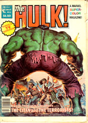 The Incredible Hulk starring Bill Bixby and Lou Ferrigno was a hit on TV, so Marvel decided to take their Black & White Rampaging Hulk magazine, and make it full color. They were calling it a “Marvel Super Color Magazine”.
My first work for Marvel was a Conan map of Hyborea, and Bill Sienkiewicz’s first Moon Knight backup story from The Hulk #13. I colored them both in my bedroom at Mrs. Chaykin’s.
Rick Marshall and Ralph Macchio (his assistant at the time) were very pleased with what I turned in, and I soon had a 56 page bi-monthly book to color. I returned to Northern California , and my coloring career was off and running.
The process we were using was a variation on the blueline system using two photostats printed on a special, supposedly non-shrinking plastic paper. I colored one using water based felt pens, Q-tips, airbrush and Cel-vinyl animation paints, and the other was used for the black plate and special effects. I called it “The Double-print Black system”, but I have no idea what they officially called it.
For the next two years I colored the Hulk and Moon Knight, until the TV show was cancelled, which led to the cancellation of the magazine as well.
A Dry Spell: After the Hulk got cancelled, I discovered how difficult it can be to get work from the west coast. Most colorists lived within commuter train distance of the Manhattan offices of the big two publishers, DC and Marvel. That made it easy to pop into the office to look for work on short notice.
Colorists are the last creative link in the Editorial chain before they turn the book over to the Manufacturing division, and suffer from one chronic problem: Lack of Time.
If the writer, the penciller, the inker, and the letterer are each just one day behind schedule, or the editor loses a day or two because of the weekend, the colorist can find him or herself squeezed into trying to finish a coloring job literally overnight. That’s why coloring often looks rushed. Sometimes it’s handed out to any available body to be done over the weekend, or to anyone in the bullpen who isn’t already busy.
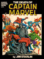 Needless to say, sitting out in Northern California, I didn’t get any of those rush jobs, especially after I turned in Jim Starlin’s “Death of Captain Marvel” graphic novel late in1982. (I found out several years later that that job being late got me a reputation among some editors as being unreliable. That reputation dogged me behind the scenes for years. Just a little reminder to all the young freelancers out there: Meet your deadlines. It’s more important than you might think. I also found out later, that in a tight printing schedule, it would cost Marvel $5,000 in lost press time every time a book was late. Once the printer booked the time, Marvel was responsible to pay even if the comic wasn’t printed in that time. They were docked every time it was delayed. Pixelcraft, a color separation company I worked with years later had missed over 20 deadlines when Marvel finally fired them!)
After having a good paying, steady comic job for two years, I was suddenly scrambling to survive. There was no work for a full-color colorist. All the regular books were spoken for.
No Eggs, No Basket: It had been several lean months, and I was really beginning to sweat when I got a surprise call on Thankgiving Day, in 1980. Danny Bulanadi is an artist/inker I’d met at conventions over the years. I colored some of his convention sketches. He’d been working on a B&W weekly comic strip for the Newfoundland Herald. The Herald was a TV guide for the island of Newfoundland , which is off the east coast of Canada between Nova Scotia and Greenland.
The Herald was owned by Geoff Stirling, and was part of a communications conglomerate he had in St. John’s , Newfoundland . He had a TV station, an FM radio station, and the Herald. His son Scott was writing a pair of patriotic, and spiritually-oriented comic strips. Danny was doing the art and lettering. Scott wanted to do a collected series of the strips in full color, and Danny recommended me.
 So Captain Newfoundland, and Captain Canada (Not to be confused with Capt. Canuck) came to my rescue.
1981-89 ~ The Experimental Era
The Independents Roll: Around this time was the dawn of the independent comics publishers. Mainstream comics in the 60’s consisted of Marvel, DC, Charlton, Archie, Gold Key/Whitman, Classic Comics, MLJ, Dell, Harvey , and Mad magazine. There were a few others like Warren’s Creepy and Eerie, but they were horror magazines in black and white.
By the ’70’s many of the smaller companies began closing. DC eventually bought most of the rights to the super hero characters. (they bought the Charlton, Archie, and Capt. Marvel family characters) Among the creators, there was a movement to retain some ownership of the rights to the characters, and to get royalties. The big companies weren’t willing to give up those rights, so the door was opened for smaller companies to give creators what the big guys wouldn’t: The rights to their own creations.
 Pacific Comics was the first to make a big move. I’d colored a Lord of the Rings portfolio by Frank Cirocco, and several comic checklist covers for them, so when they decided to get into comic publishing they gave me a call. They signed up Jack Kirby, Steve Ditko, Mike Grell, Bruce Jones, Neal Adams and this new guy Dave Stevens to launch their comic line.
Just a little aside here: Joe helped me color an issue of Starslayer one day, which gave him a sideline to supplement his painting. He went on to color the Rocketeer with Dave Stevens, which eventually led him to a lucrative coloring career with Image comics, as well as opening doors for him to develop into a graphic story painter.
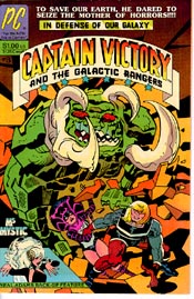
In fall 1981, I got the job coloring Jack Kirby’s “Captain Victory” and Mike Grell’s “Starslayer”. It was the first time I’d tried flat, coded, hand separated color.
I had visions of doing flat color like it had never been done before by using some of the full color tricks I’d learned on the Hulk and Moon Knight. I even went so far as to add Zip-a-tone to Jack’s original art on Captain Victory #1 to get the added tonal values.
My good intentions aside, the coloring came out dark, and muddy rather than dramatic and moody. It wasn’t the best story Jack ever wrote, and I’m afraid I really wasn’t giving it the look he wanted, so he fired me. I’ve never really been comfortable with flat color.
Fired Out to Westport: Even though it was a shock to be fired by a boyhood idol, I probably deserved it. I still had Mike Grell’s book, and I had some small side projects, so I just kept on searching for more full-color work.
With the success of Starlin’s Capt Marvel graphic novel (It went to 18 printings), Marvel started putting out more graphic novels, and began Epic Magazine, which was to be Marvel’s version of Heavy Metal Magazine, except the stories were all new by American creators. (Epic Magazine began offering royalty deals to the creators, and eventually led to the entire Epic line of creator-owned comics.)
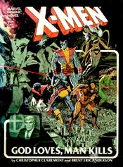 The 5th Graphic Novel Marvel produced was an X-Men project. “God Loves, Man Kills” was written by Chris Claremont, edited by Louise Simonson, and drawn by my long-time friend, Brent Anderson. Brent asked me if I would color it, and he promised me a royalty, which was a first for me. I’d tried and tried to get even a tiny piece of Starlin’s novel, but I’d had no luck, so I jumped at Brent’s offer.
He invited me to stay in Westport , Connecticut while we worked on the project. His roommate, Joe Chiodo was another old friend. They also lived next door to Bill and Frankie Sienkiewicz, whom I’d known since coloring Bill’s Moon Knight series in the back of the Hulk Magazine.
Bill, Brent, and Joe shared a studio in Westport , and Frankie was Jim Shooter’s secretary at Marvel. It was a nice little creative comic community. I feel privileged to have been a part of the studio for a few months. It was an amazing time. Brent and I were working on the X-Men novel, and I was still coloring Starslayer. Bill was taking art lessons and blazing new trails on his regular Moon Knight comic as well as popping out beautiful painted covers every few days. Joe was struggling in the highly competitive paperback cover market.
I learned that if you are there, the work is too…: I colored a story Bill did for National Lampoon that led to several other assignments for them. (Michael Golden, Kevin Nolan, and Frank Thorne were some of the others…)
That trip actually had a very unique beginning. I arrived in New York on a Friday morning. I made my first stop at the Marvel offices where Brent and Weezie (Louise Simonson, our X-Men novel editor) and I were to have a meeting before going out to Connecticut . It turned out that she was assembling a weekend coloring crew for a rush job. Marvel was doing the comic adaptation of the Jim Henson film “The Dark Crystal”, and it was going to be in full color.
She had 48 pages that had to be colored by Monday morning. Most of the colorists she had been able to round up had little or no full-color experience. Since I was fast, familiar with the techniques needed, and better at rendering, Weezie promoted me to color supervisor. I ended up touching up most of the pages, and generally unifying the look. We met the deadline, I made $1,200 I didn’t expect, and I got a bonus treat. I got to go to the Muppet Mansion near Central Park . I got to see the Creature Shop where many of the Muppets get built.
That fall turned out to be filled with plenty of work, artistic inspiration, a Halloween party at Bernie Wrightson’s upstate New York home, and a weekend spent at Neal Adam’s Long Island beach house. Not to mention how beautiful fall is in New England.
The Experimental Era: When I returned to California , the age of color experimentation was on. Small comic companies were popping up all over. Pacific Comics from San Diego, First Comics from Chicago, Eclipse comics out of Guerneville, California, Comico and Gladstone. There was a big surge of new markets.
Every company was exploring color on their own. No one was really happy with the old 64 color hand separated look. A variety of styles were tried. Everyone liked full color, but the costs were too high. Flat color was still the approach as they searched for new technologies. Blueline systems were kind of mysterious, and the double print system at Marvel had been pretty well abandoned due to registration problems.
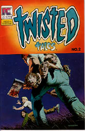 Pacific comics launched two Bruce Jones anthology books in 1982. Twisted Tales and Alien Worlds were modeled after the EC horror stories. Short, with a trick ending. I colored the first issues of each with the understanding that they were going to be hand separated somewhere. The first issue of “Twisted Tales” gave me the opportunity to color a Richard Corben story, which was designed to be full color. The rest of the issue was hand-separated.
Since I’ve never liked to ruin my color guides with coding, I used to write the codes in Sharpie on an acetate overlay. That way after the job was done I could throw the codes away and still have nice-looking color guides.
The first issue of Alien Worlds was going to be all hand separated, but at the last minute, on one Al Williamson science fiction story they decided to try something different. Apparently they liked my color guide so much that they took off the acetate with the codes and shot my colors as full color. The results were great. So much so that Al sent me an original Rip Kirby daily strip to thank me for what he called: “One of the best color jobs he’d ever gotten”. It was right there that I realized how much it meant to an artist to have a colorist who enhanced his art rather than destroyed it. Too many times the color in comics has been truly wretched.
There’s an old saying in comics that: “Bad color can ruin good art, but good color can’t save bad art.”
As a result of Al’s story, both of Bruce’s books began using full color. For Pacific at that time, I was just doing full color on Photostats. They shot the color and the black from the same art. I worked the same size as the comic, and had to make sure that I used transparent colors so I didn’t mess up the line art. The separations were probably shot 4 pages at a time to save money. They were just developing the drum scanner technology at that time, so the pages needed to be flexible to wrap around the drum. Prior to then, I usually mounted my coloring onto illustration boards.
Somewhere along the line, the Greyline process was figured out. I think it was Cat Yronwode at Eclipse who came up with the idea. On a Photostat a 10% grey version of the lineart was printed. On a transparent overlay, the black line art was printed. This was the same concept as the blueline, but they could easily scan them on the drum scanner. It gave a pretty satisfactory look most of the time.
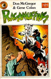 The first time I worked on greylines for Eclipse Comics was December of 1984 on a Don Macgregor /Gene Colan project called Ragamuffins. It was pencil art, so Cat was very concerned that the color not overpower the delicate detail, but delighted with the results, and it led to lots of other work for Eclipse.
For the next few years I colored in any number of styles. It was during this time that the Olyoptics studio was founded. I’d been using the name for years, but I had primarily worked alone. During this time, Abel Mouton and Reuben Rude began working with me.
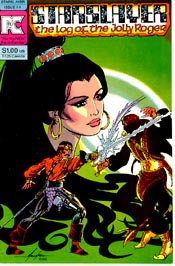
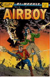 I colored greylines for Eclipse (Airboy, Mr. Monster, Aztec Ace, Ragamuffins, etc), bluelines for First Comics (Shatter and Time2), and DC (Blackhawk, Cosmic Odyssey, Gilgamesh II, Twilight), and flat and full color for the Epic line. (Coyote, Starstruck, Timespirits, the Bozz Chronicles)
I also colored a strange overlay method for Gladstone on their Disney projects.
Everyone was looking for the best coloring approach.
I had an idea that computers might be the next big thing. No one paid much attention until 1987 when I got my chance.
Before the computer revolution: I wasn’t the only person who recognized that desktop publishing might prove a good coloring tool as well. Unfortunately, no one knew how to do it yet. This was well before Photoshop had been written. Machines weren’t very powerful yet. Memory wasn’t cheap. There were only a few players in the lower end graphics market. The big systems were outrageously expensive. (see Newfoundland , NAB sidebar) There was a company called TimeArts, which developed a graphic arts program called Lumena. It turned out that the company was in Santa Rosa , California , which is only 80 miles from where I live.
I’ve always had an interest in computers. In the early 80’s I bought an Atari 800 computer, and then one of the first Macintosh computers. I loved them for word processing, and games but the graphics were really crude. There weren’t color printers, or anything like that yet. The Lumena system used an AT&T Targa graphics card, which was designed for video, but it became the basis for color separation software. The only output was either a videotape recorder, or a film recorder, which made color slides.
I paid $75 an hour to hire James Dowling, one of their computer artists to help me prepare a slide to show to Jim Shooter, then editor-in-chief of Marvel. It cost me $450, but Jim wasn’t impressed. He didn’t see the potential. So, I just went back home and kept watching the computer market evolve. I had learned about computer conventions, and attended SIGGRAPH (Special Interest Computer Graphics Group) trade shows, and tried to learn all about this new specialty.
In 1987, I took a chance and made a trip to an NCGA (National Computer Graphics Association) convention in Philadelphia . It turned out to be the most important convention trip I would ever make.
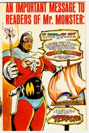
“Ain’t nothing gonna Hurtchoo!”: Sometimes you gamble. Go on a hunch. Trust to luck. The NCGA convention in Philadelphia was the biggest gamble I’d ever tried. I’d read in Computer Graphics World that a company called Pixelcraft was working with Mike Saentz on an Iron Man graphic novel that was to be color separated by computer. Mike was the artist who had drawn Shatter for First Comics on the Macintosh computer. Shatter is officially the first comic drawn with a computer, but the coloring was done blueline. The Mac didn’t have color separation capabilities. (The first computer colored comic story was “My Fears: in Mr. Monster #5, Feb. 1986, from Eclipse. However, that was a 4 page weirdo experiment, and not at all suitable as an ongoing technique.)
 Mike was providing the showcase, and Pixelcraft provided the software. I wanted to see what was really going on. I decided that I had to go. I bought a ticket, and tried to get a hotel room. The entire city was sold out. Every hotel I tried was full. I decided to just go for it. I had no idea how, but I knew it would work out.
How it turned out was that the lady sitting next to me was a bed and breakfast broker for people in the downtown area, relatively close to the convention center. After explaining my situation to her, she made a call when we landed, and I ended up in the home of a lady who worked for the Philadelphia department of education. She rented out her son’s room to bring in a little spare money from time to time.
My immediate problem solved, I was all of a sudden stuck in her house at 7 pm on a Saturday night, intruding on her and her son. I asked if there was anything going on nearby. She told me that South Street had lots of restaurants, music, and a theater, and was a pretty popular hangout. I decided to go.
She gave me a key, told me to go one block over, and take a left. I couldn’t miss it. It was just a few blocks. Off I went. It was a warm summer evening. Her house looked to be part of a two hundred year old row of houses, all joined and opening onto an alley-like street. I walked the block over to South St. , where it was pretty dark. I looked down the street, but didn’t see much activity. In fact some of the buildings were partly in ruins, with long dark stretches between the streetlights. There were a few people on the street, so I decided to just walk. The first few blocks weren’t very encouraging. I was starting to get nervous. It was becoming increasingly apparent that this neighborhood was predominantly black.
Where I grew up, and still live, in the country, there were 3 black kids. No Mexicans. No Asians. It was all white loggers and farmers. Suddenly I found myself in urban Philly getting a little bit scared. I started walking a little faster, putting on the New York walked I’d learned from Howard years before.
Then I walked by a park, or an avenue of sorts that led off into the darkness. It had benches that people were sitting on. Somewhere in the darkness a boombox was playing. On the bench nearest to the sidewalk two black men were sitting when I stole a look into that park. One of the men must have seen something in my face, because out of the blue he said to me: “What choo worried about? Ain’t nothin’ gonna hurtchoo…”
I looked at him, and he just looked back. I don’t remember a smile. He wasn’t kidding. I just kept walking, but I felt like I had been given a magic potion. A fear destroyer. As I walked, I felt stronger, safer, and totally comfortable. That man gave me a very precious gift that night. He rescued me from my own fear. Five or six blocks further down the street the action district definitely became obvious. For the remainder of that trip, I was virtually fearless. I just went for it. I talked to anyone. I went to all black jazz clubs by myself. I discovered the Rodin museum near the Philadelphia Museum of Art. I saw the originals of famous paintings that I’d seen for years only in books. I met a cool girl holographer that I got to hang out with. I maxed out my credit card to pay for the tutorials, which was the only way I could go talk to Mike Saentz and Pixelcraft, who were scheduled to be the very last class of the very last day. I was committed to staying for the whole show. That’s all there was to it. The whole trip, in retrospect, had a fated quality to it.
After Mike gave his presentation, I finally got to talk to Kenny Giordano, the software developer. His program seemed like just what I had been looking for, but it was still too expensive for me. I got a chromalin proof as an example, and went home buzzing. I didn’t quite know what to do, but I didn’t have too long to wait before I found out.
Just Before Akira: Mike Saentz has always been an Apple computer user. He had been part of a creative team from Chicago that released a program called ComicWorks. That evolved into VideoWorks, which became Director, now owned by Macromedia. He never was quite comfortable with the IBM PC world. I visited him in his New York Studio while he was still in the early stages of the Iron Man graphic novel “Crash”. He was not having fun with the crossover problems with Pixelcraft’s IBM-based program.
He had a buddy who was developing a software package to work on the Mac that would output color separations. Right in the middle of the Crash project, he cut Pixelcraft loose, and took his project to his Mac-based pal.
Left out in the cold, Pixelcraft had a software product, but no way to showcase it. They needed a project.
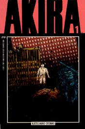
About this time, I was given 4 pages to color as a test for a big series. Something called Akira from Japan , written and drawn by Katsuhiro Otomo. Comics in Japan are black and white, but for the English translation they wanted it to be in color. I’d never heard of Akira, but I decided to pull out all the stops on my color test. It was great art and good paper, so I used every trick I had. Airbrush, colored pantone film, colored pencil, rich saturated felt pens, paint, everything I could think of. I don’t know what the other colorists’ samples looked like, but I know they couldn’t have looked anything like mine. Needless to say, I got the job. They flew me to New York to meet the artist and his editor. On the flight east I looked at the pictures in the two collected volumes of Akira that my friend Ken Macklin had loaned me. Parts of it had been translated by a friend of Ken’s, but not much. I met with Archie Goodwin, Otomo (the artist/writer) and Yuri-san (Otomo’s editor), and we talked about color styles, then we went to get sushi and drink beer.
At first Marvel got hand separations done from my guides. The separations weren’t very exciting, in fact rather bad, so I suggested that they let me try to color it on the computer. They said they didn’t care how I did it as long as it looked good and was within their price range. Kenny Giordano of Pixelcraft and I worked out a deal with Gene Durante from Marvel’s manufacturing Department, and the Olyoptic computer division was in business.
 Two days after Christmas 1987, Federal Express delivered two boxes to my office in downtown Point Arena. It was an IBM 286 12mhz box, loaded with an AT&T Targa graphics board, DOS, their “Kaliedoscope” software, and a monitor. It also had a handmade heat diffuser to cool off the math co-processor.
Taped to the case was a one page sheet of instructions about how to run the system. It was very simple. I set it up and loaded in some of the disks of Akira art, then spent the next three months coloring Akira #1. The system chugged like an old farm truck. The software was buggy and the machine was erratic. It really needed that heat diffuser, because when it overheated (every day, some days many times a day), it froze, and I’d lose everything up to the last save. It got so bad that I’d save the page after every polygon (each traced off and enclosed area of color). I colored all but 3 or 4 pages, which Abel Mouton helped me with. Eventually
In the early days, Kenny scanned the pages, then shipped me the disks. I colored them on the system, and sent the disks back to him. From there he made proofs and output the film. I didn’t see a single proof until the issue came out in print for the first 10 issues. With issue #11 I got a printer and a scanner, so I could actually check things. All the issues before were kind of seat-of-your-pants, hope for the best.
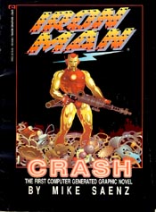 Computer Color Arrives: Mike Saentz actually beat us to get the Iron Man graphic Novel “Crash” out a week before Akira #1 in Spring 1988. “Crash” turned out to be a muddy, strange, stilted-looking book that is a milestone experiment, but does not hold up well over time. Akira, even though simple, still looks good. I consider Akira #1 to be the first time that a color guide artist was his own separator in comics (Richard Corben notwithstanding). I was able to make the color more a part of the art, and I had the ability to use gradations anywhere at all. I also had the ability to create colors that no one else would have.
About this same time, over at DC, Declan Malone, the Irish entrepreneur, and production manager Bob Rozakis were working on modifying TimeArts Lumena software to coloring comics. The only difference was that they weren’t trying to push any limits. They just wanted it to eliminate the need for hand separations. They didn’t want it to look different.
I wanted to be different. I wanted Akira to look like nothing else. I tried to do something new every issue. I was rewarded for my efforts when I won the Harvey Award for best color in 1989 for Akira.
The computer age was on. There was no turning back.
 For the next couple of years, “Akira”, an Epic comic, was the only regular computer colored book. For DC, the first computer coloring project I did was the comic adaptation of the first Batman movie, starring Michael Keaton and Jack Nicholson. At some point we began computer coloring Alien Legion for Epic. Generally speaking, though, Marvel wasn’t interested in computer color because it did cost more than the old-style separations. In fact, we had to adjust the price up 3 times over the first two years of Akira to make ends meet. I again have Gene to thank for that. He was always on our side.
The one book that I really wanted to color with computers was a book drawn by a hotshot young turk artist who was an Akira fan. It was Todd McFarlane’s Spiderman series. That series sold millions, but Marvel didn’t want to spend a few thousand more on the color separations. The color was never very good on that series.
A few years later, I got the chance to work with Todd.
1992 ~ The Image Era
The Image Era Changes Comic Color: This is a fact. No comic line ever shook up the comic industry as much as Image. The industry changed fundamentally during the Image heyday. The look and feel of comics, the distribution system, and the financial stakes all got changed. And computers were right in the thick of it.
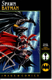 High quality computer color became a part of the Image look. Beginning with Todd McFarlane’s Spawn, Mark Silvestri’s Cyberforce, Sam Kieth’s the Maxx, and Erik Larsen’s Savage Dragon, the color became one of the stars of the show. At one point Olyoptics was coloring and/or separating 70% of the Image line of comics. Eventually it got to be too much for us to keep up with, so several of the Image studios set up their own coloring departments. Top Cow, Wildstorm, and Extreme all had their own in house color departments, so they could have complete control. It was also because each of the artists who owned those studios was often late, and needed a dedicated coloring department to turn their books around quickly.
This is where a fundamental split in the coloring industry began.
The original owner of the Kaleidoscope software, Kenny Giordano, had been burned a couple of times in business, and tried to expand too much, only to have it all implode. They ended up losing the rights to their own software. Ken Giordano’s son, Khouri had written the program when he was 17. It was filled with programming quirks that only Khouri understood. Since Khouri was mad at how his father had been treated in the deals, he wouldn’t write code for the new owners. The only way Mary Codd and Victor Barrett, who now owned the software could add new features was by starting to build the code from the ground up. They couldn’t afford that, so they just kept marketing it as long as they could, with little cosmetic changes.
The Codd/Barrett system was what Olyoptics used. All of the spin-off companies from Olyoptics, IHOC, Electric Pickle, and Android Images used Codd/Barrett software. Almost all the Image guys used Photoshop from Adobe.
In those days the Codd/Barret software cost $5,000 per workstation for the software, but the computers were relatively inexpensive IBM clones. They didn’t need very powerful processors, and used a vector-based system that made small files, which were easy to store and modem.
Photoshop uses a bitmapped system that requires lots of memory and processing power. The Photoshop software was relatively inexpensive ($500), but at that time memory was about $50 per megabyte and you really need at least 64 megabytes of RAM, which meant spending thousands of dollars just for memory. Photoshop was not initially available on the IBM. Translations between the two systems were difficult. Most people had either one or the other system, but not both.
Olyoptics was slow to make the shift to Photoshop, but Codd/Barret went out of business, so there was no alternative. Photoshop is now the industry standard for art and coloring software.
To my knowledge, all comic book coloring is now done with Photoshop. The last Codd/Barrett holdout was IHOC’s Abel Mouton and Reuben Rude, who used it to color Erik Larsen’s Savage Dragon up to issue #100. From #100 on, Reuben will be coloring it by himself in Photoshop.
1995-2002 ~ The New Reality
The New Reality: Comic book coloring and color separation has been completely changed by computer technology. A comic book colorist is now also a color separator. With computers as cheap and fast as they are, and a fully licensed copy of Photoshop selling for about $600, a person can be set up in business for under $2,500. That money will buy a system that is as good as anything anyone in the industry is currently using.
 Coloring is increasingly more decentralized. There aren’t any big color shops anymore. People tend to work out of their homes, or in small studios. The internet has made it possible to email or FTP files, so the artwork never has to leave the company offices. Proofs can be sent online, even though the accuracy of JPEG proofs from monitor to monitor may not be trustworthy.
Computer coloring is now a level playing field as far as the equipment is concerned. When you have Pentium or G3 processors getting speeds above 500 megahertz, and you have hundreds of megabytes of RAM, and gigabytes of storage, (Which is practically every new computer these days), then you have enough power to do just about any kind of graphics. All you need is a good calibrated monitor, a scanner, a color printer, a CD burner, and of course, a Wacom tablet.
I couldn’t color without that tablet. It has a pen instead of a mouse. The tablet is the key to drawing with a computer. A mouse is very crude by comparison as a drawing tool. The mouse is good for some tasks, but drawing is not one of them.
The secrets to color in this computer age all lie in how you use the software. You can work in all kinds of styles. Good color knowledge is more important now than ever. The computer lends a finish to the end product, but your color choices, and your rendering (or lack of) determine how well your color works. Also, your knowledge of the realities of the printing process can make the difference between clean, vibrant color, and muddy, dead color.